I am a russian cartographer Alexander Pronin and I am going to tell you how we together with my colleague Nikita Slavin, a map of the age of the houses of the city of Vladimir was created.
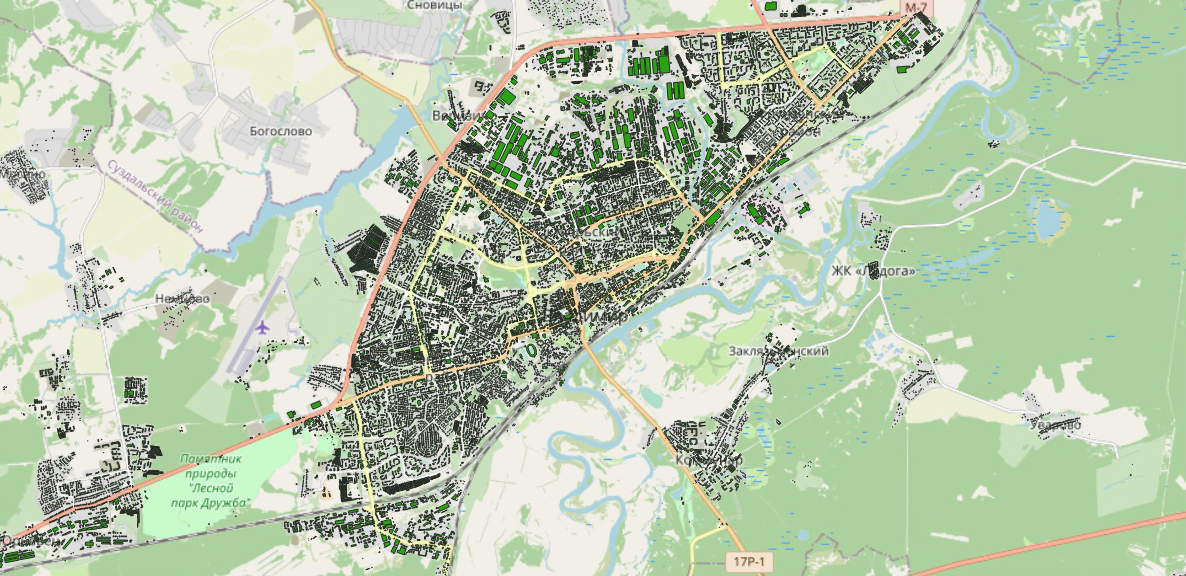
For the layer with buildings I used a free map from OpenStreetMap. This layer contains the address, which is divided into columns, names of the objects and numbers of storeys. I collect data on the year of construction, address, name of the object and photos from several sources.
The first one is my project владимирдом.рф It’s a plot that I created to show the residents of my hometown how our city was built up. In this case I took the year of construction data from the website of the Ministry of Housing and Communal Services, for kindergartens and schools — from their official websites. A lot of information was sent also by site users. The map only shows the year of construction.
The second is cadastral data. I am interested in capital construction projects. Many of them have the year of construction and address indicated.
The third is the open data site of the Ministry of Culture. Here we are looking for objects of cultural heritage. I collect data on the name of the object, address and photograph.
The fourth is wikimapia.org. There is also the name of the object, address and photograph. After collecting the data, we start processing them.
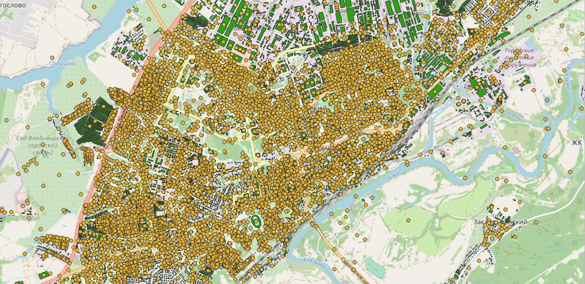
To process the data, I used the MapInfo program. For data conversion — Excel. The ultimate goal is to collect all the data on one layer. I start with the building layer from the OpenStreetMap download. I upload data to an Excel spreadsheet to combine data with an address from different columns into one. I use the link function. I load the file from Excel into MapInfo and put down the resulting address by a unique value. We get a layer in which the addresses are correct and the number of storeys is indicated.

OpenStreetMap
Further processing was carried out according to one algorithm. In MapInfo, in the main building layer, I created a column indicating the source and data type. Using the «Update Column» process, the data from points that fell into polygons with buildings were recorded.
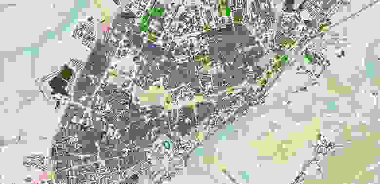
OpenStreetMap + data владимирдом.рф

OpenStreetMap + cadastral data
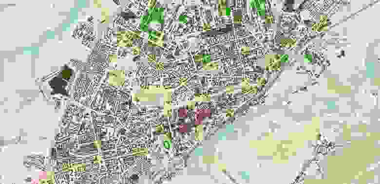
OpenStreetMap + open data site of the Ministry of Culture
OpenStreetMap + data wilimapia.org
I unloaded the resulting table into Excel and began to combine data from different sources into one column by type. I don't touch the data that was in the layer with buildings, but start filling in the voids from other sources. According to the year of construction, the priority is given to the data from my web site владимирдом.рф because they have been checked and viewed by a lot of people before i started working on this project.
For the address and name, the data from the wikimapia.org site takes precedence, since they are more complete. Photo priority is given to open data by the Ministry of Culture, as the quality of photos is better than wikimapia.org. After processing the data from the table, I upload it to MapInfo and pull up the data by a unique value. As a result I get a layer with buildings and data:
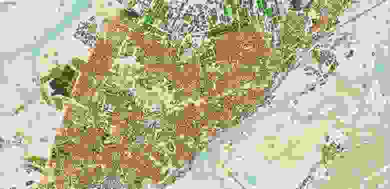
In total I got 21429 buildings on the map and I know the year of construction for 8017.
Red polygons – year unknown, green — known
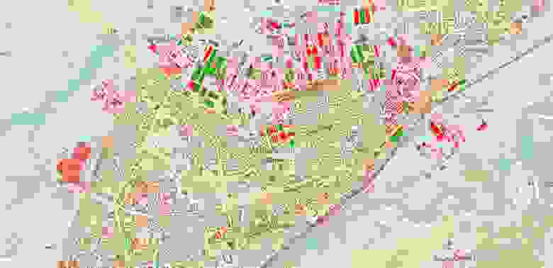
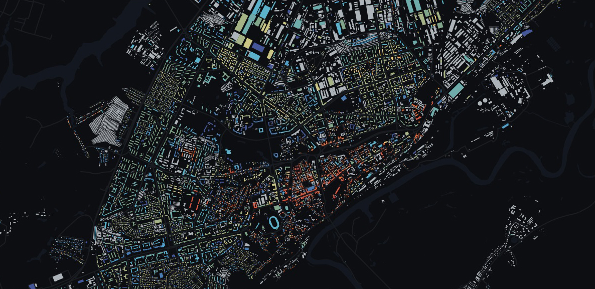
The graph shows that a large number of houses were built in 1917.
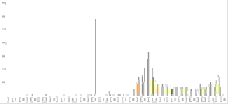
I can assume that many pre-revolutionary buildings just were marked with one year. .Most likely this will not affect the overall view because most of the buildings are located in the central part of the city.
Let's move on to visualization.
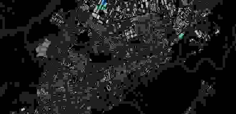
I am rendering data in QGIS. The color palette depends on the year of construction and consists of a transition from hot to cold colors. I take a dark basemap from CartoDB and a Spectral color palette pre-installed in QGIS.

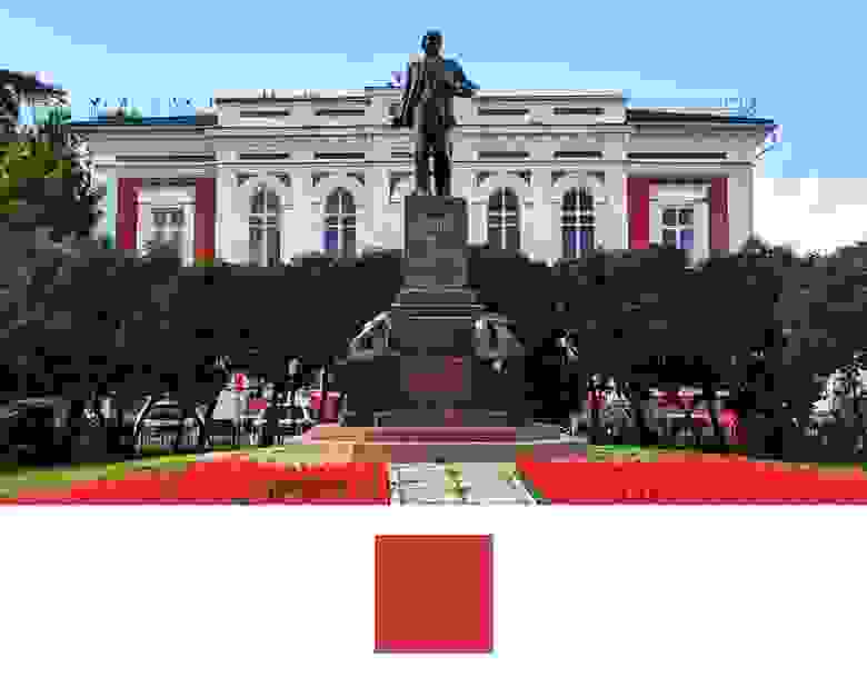
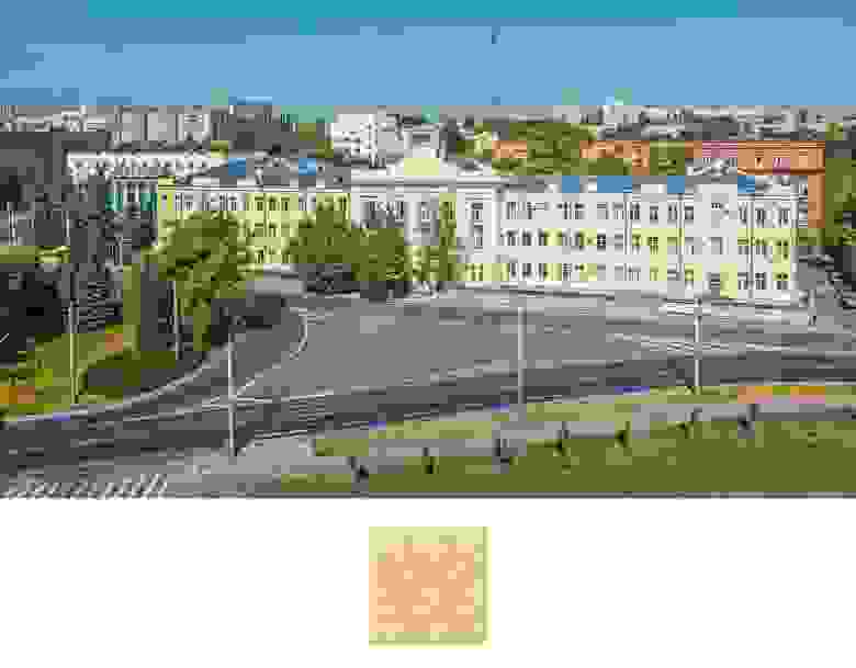
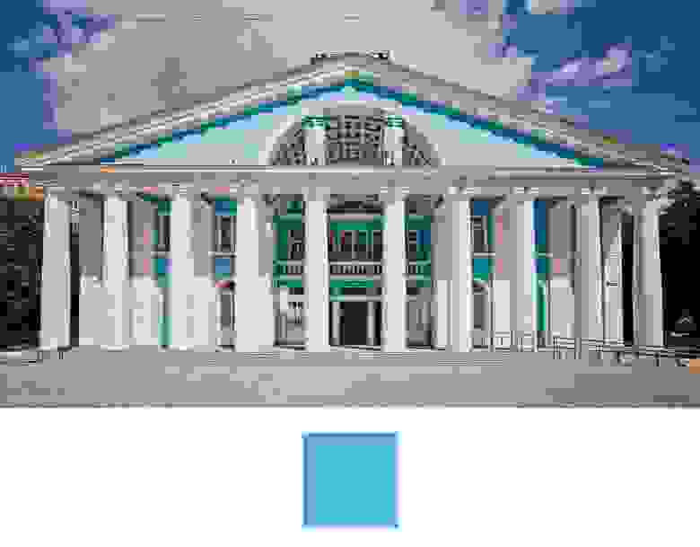
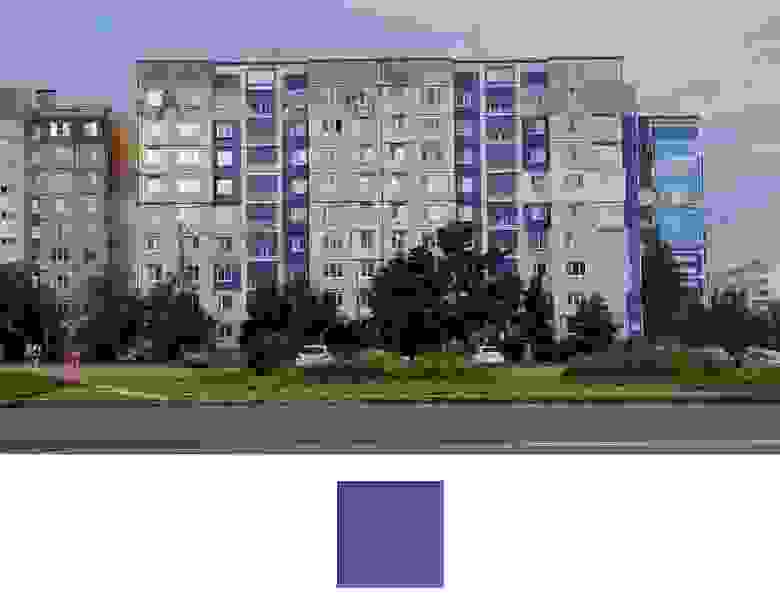
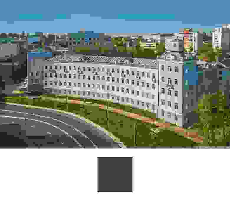
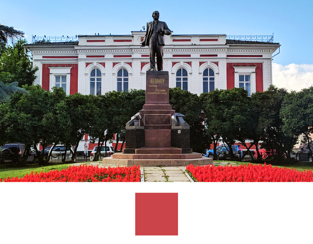
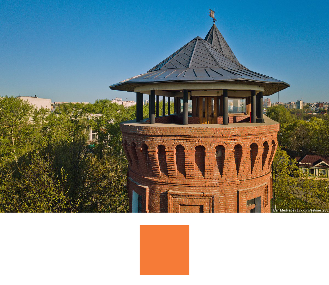
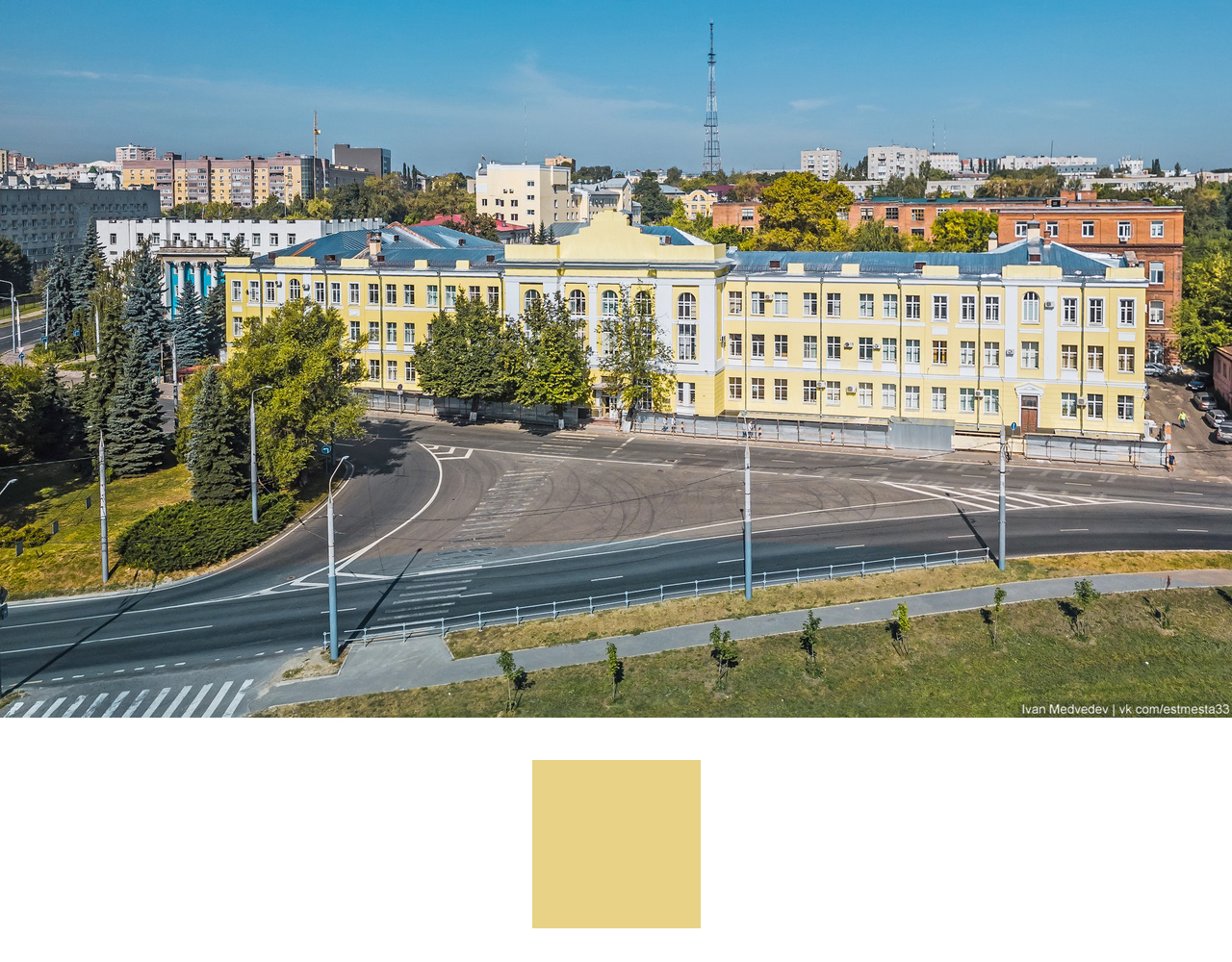
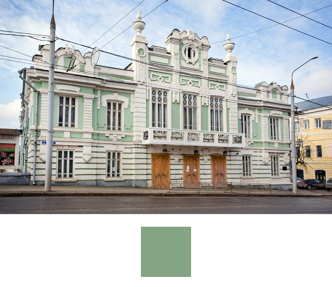
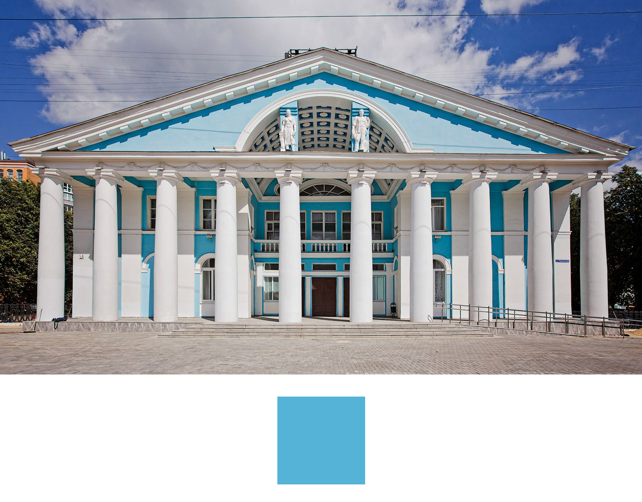
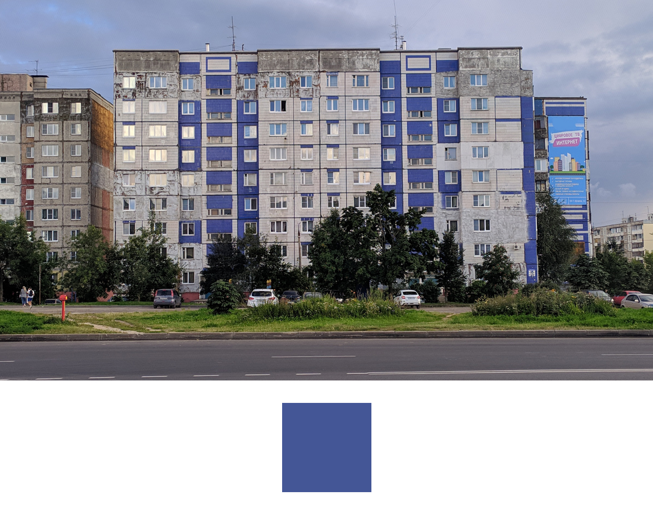
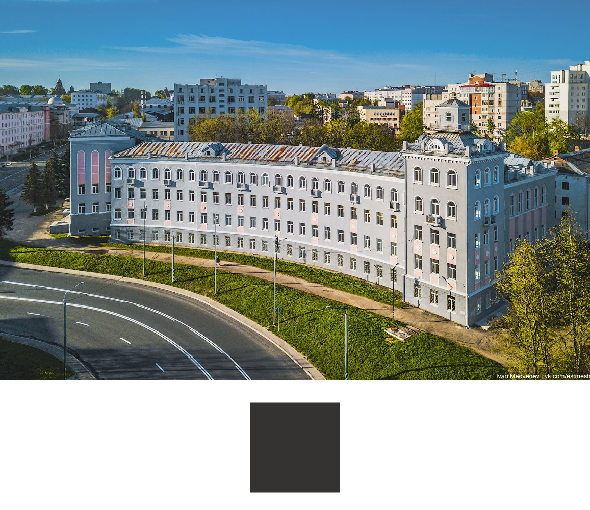
For red and blue colors, I take photographs of the bank building on Cathedral Square and the panel house on Vasilisin Street. I take the rest of the photos from the photographer Ivan Medvedev. Orange is a water tower, green is a puppet theater, yellow is house No. 3 on Lunacharsky Street (formerly Sovnarkhoz), blue is the City Palace of Culture and gray is the Polytechnic College.


Right there in QGIS I make a basemap. It will have 3 layers: solid color, roads and water features.

Putting it all together and adjusting the distribution of the timeline across the palette. Until 1900, I make large time intervals, since there are not so many houses left of them. From 1900 to 2000 I divide by decades. and I slightly correct the information based on the dates of the heads of state. As a result we get this.
I use the «Geosemantica» data hub to place the map on the Internet. The base layer and the building layer are loaded onto it. When you click on a building, all the information that was collected on it opens.
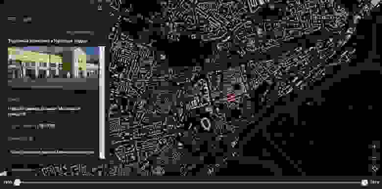
Any user can click on the «Edit» button and suggest their edits, as well as upload his photo to the building.
Data
For the layer with buildings I used a free map from OpenStreetMap. This layer contains the address, which is divided into columns, names of the objects and numbers of storeys. I collect data on the year of construction, address, name of the object and photos from several sources.
The first one is my project владимирдом.рф It’s a plot that I created to show the residents of my hometown how our city was built up. In this case I took the year of construction data from the website of the Ministry of Housing and Communal Services, for kindergartens and schools — from their official websites. A lot of information was sent also by site users. The map only shows the year of construction.
The second is cadastral data. I am interested in capital construction projects. Many of them have the year of construction and address indicated.
The third is the open data site of the Ministry of Culture. Here we are looking for objects of cultural heritage. I collect data on the name of the object, address and photograph.
The fourth is wikimapia.org. There is also the name of the object, address and photograph. After collecting the data, we start processing them.
Geoprocessing
To process the data, I used the MapInfo program. For data conversion — Excel. The ultimate goal is to collect all the data on one layer. I start with the building layer from the OpenStreetMap download. I upload data to an Excel spreadsheet to combine data with an address from different columns into one. I use the link function. I load the file from Excel into MapInfo and put down the resulting address by a unique value. We get a layer in which the addresses are correct and the number of storeys is indicated.
OpenStreetMap
Further processing was carried out according to one algorithm. In MapInfo, in the main building layer, I created a column indicating the source and data type. Using the «Update Column» process, the data from points that fell into polygons with buildings were recorded.
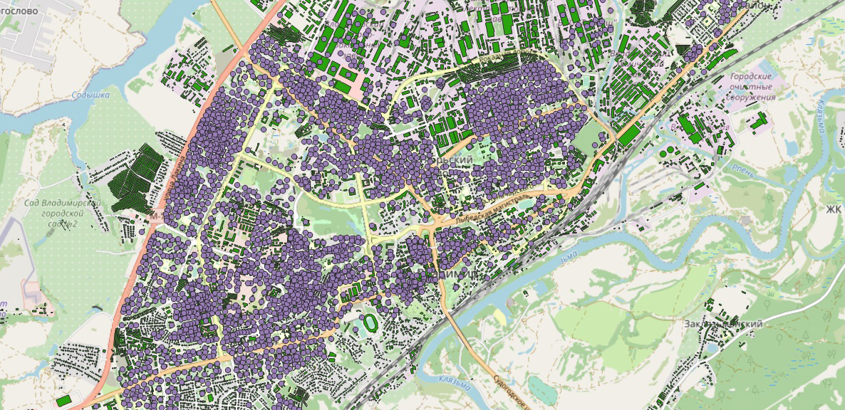
OpenStreetMap + data владимирдом.рф
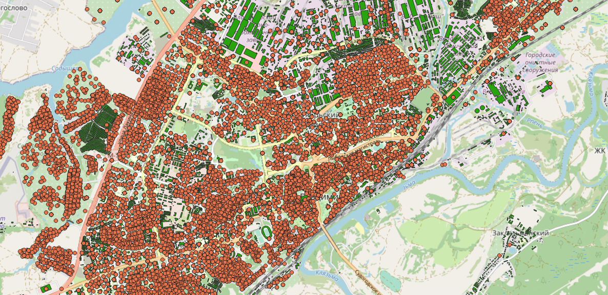
OpenStreetMap + cadastral data
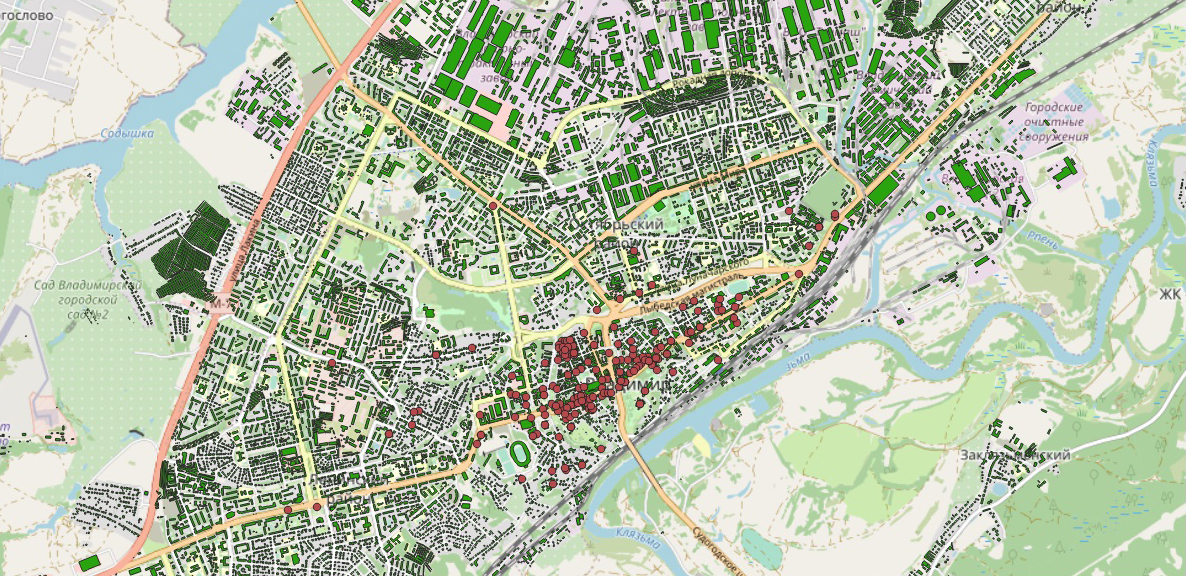
OpenStreetMap + open data site of the Ministry of Culture
OpenStreetMap + data wilimapia.org
I unloaded the resulting table into Excel and began to combine data from different sources into one column by type. I don't touch the data that was in the layer with buildings, but start filling in the voids from other sources. According to the year of construction, the priority is given to the data from my web site владимирдом.рф because they have been checked and viewed by a lot of people before i started working on this project.
For the address and name, the data from the wikimapia.org site takes precedence, since they are more complete. Photo priority is given to open data by the Ministry of Culture, as the quality of photos is better than wikimapia.org. After processing the data from the table, I upload it to MapInfo and pull up the data by a unique value. As a result I get a layer with buildings and data:
- Name
- The address
- Year built
- Number of storeys
- A photo
- Photo source
In total I got 21429 buildings on the map and I know the year of construction for 8017.
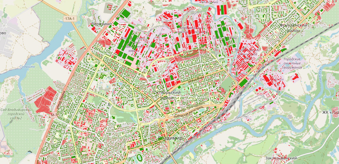
Red polygons – year unknown, green — known
The graph shows that a large number of houses were built in 1917.
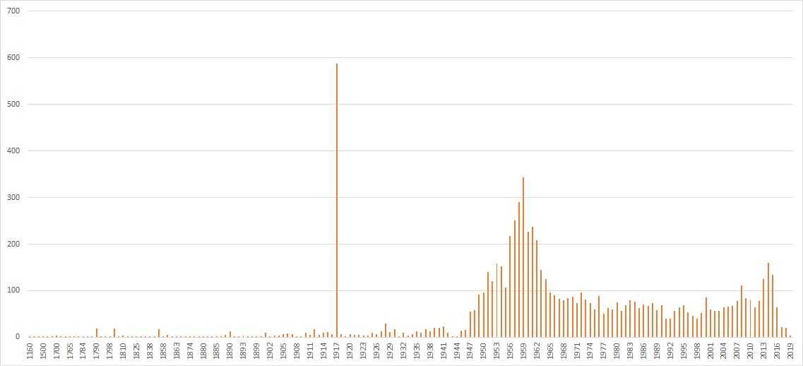
I can assume that many pre-revolutionary buildings just were marked with one year. .Most likely this will not affect the overall view because most of the buildings are located in the central part of the city.
Let's move on to visualization.
Color palette
I am rendering data in QGIS. The color palette depends on the year of construction and consists of a transition from hot to cold colors. I take a dark basemap from CartoDB and a Spectral color palette pre-installed in QGIS.
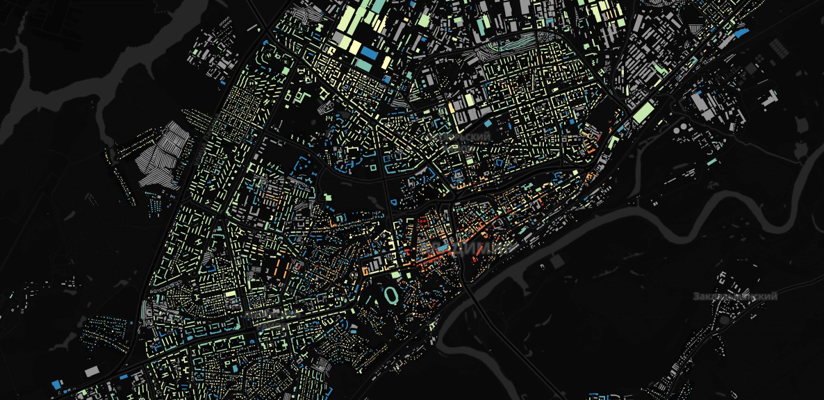
For red and blue colors, I take photographs of the bank building on Cathedral Square and the panel house on Vasilisin Street. I take the rest of the photos from the photographer Ivan Medvedev. Orange is a water tower, green is a puppet theater, yellow is house No. 3 on Lunacharsky Street (formerly Sovnarkhoz), blue is the City Palace of Culture and gray is the Polytechnic College.
Right there in QGIS I make a basemap. It will have 3 layers: solid color, roads and water features.

Putting it all together and adjusting the distribution of the timeline across the palette. Until 1900, I make large time intervals, since there are not so many houses left of them. From 1900 to 2000 I divide by decades. and I slightly correct the information based on the dates of the heads of state. As a result we get this.
Publishing
I use the «Geosemantica» data hub to place the map on the Internet. The base layer and the building layer are loaded onto it. When you click on a building, all the information that was collected on it opens.
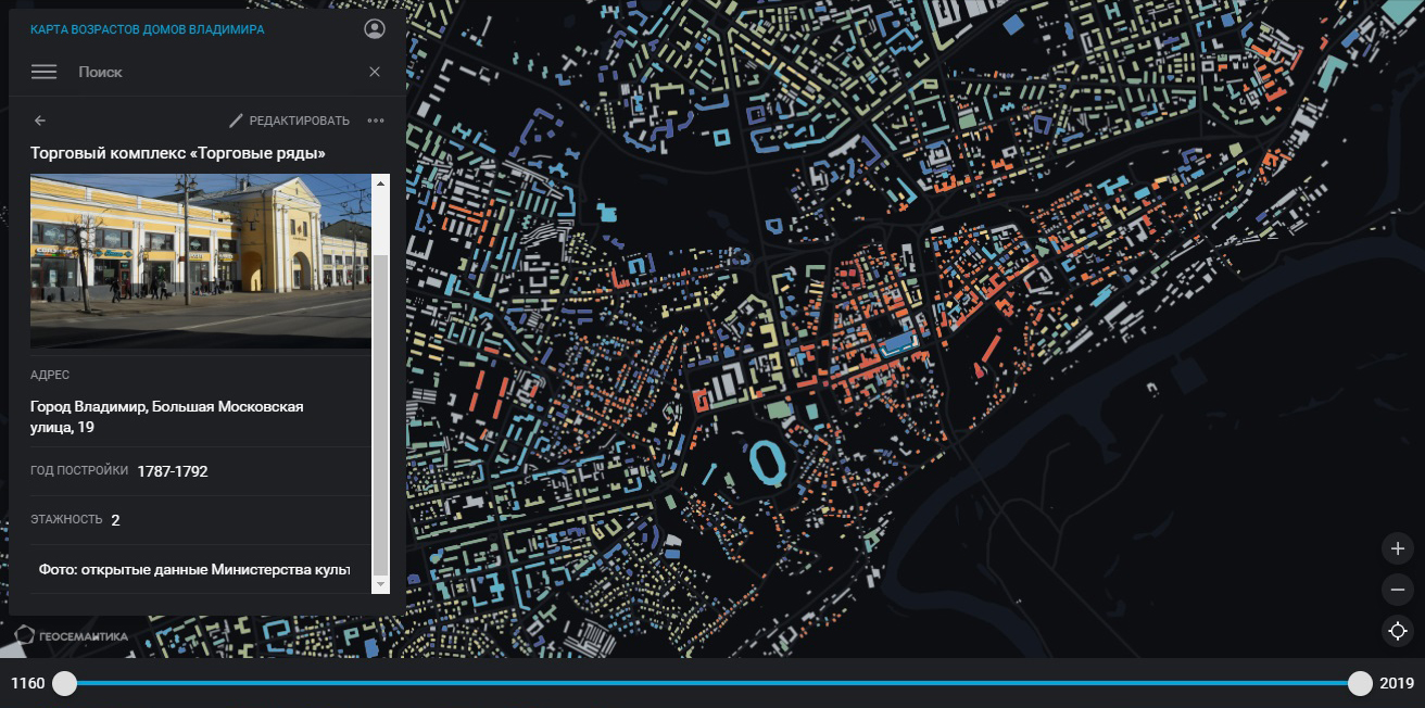
Any user can click on the «Edit» button and suggest their edits, as well as upload his photo to the building.
