Styles, by default, in wpf, in Avalonia, are neutral, and far from always suitable for the tasks we need. In this article, I would like to talk about the basics of working with styles and show a couple of interesting examples.

Why do we need styles in the Avalonia framework?
For a better understanding of styles, first look at an example:
Rounded button (something similar to a ubuntu gnome)
To do this, create in the standard template ( how to create a template ) a simple layout from the panel stack and a couple of buttons.
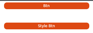
Now we can set to the buttons main background and font colors, but then we will have to duplicate the code. Style will help to avoid this repetition.
Add the appropriate style to the window:

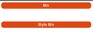
We get something similar, but it would be nice to round the edges. Unfortunately, no matter how we try, it’s impossible to round the edges of the button, but you can round the edges of the template responsible for displaying the button. To do this, add another style:

It turned out almost similar, but there is a problem — when you hover over the button, a gray frame appears (hello from the standard style).
To do this, turn to the css : pointerover pseudo-class and add another style:
So much better.
But what if I want to apply styles only to specific buttons?
Add one more button to the template and set the Classes attribute to the buttons that we want to “decorate”.
And we’ll indicate to the styles that we need to influence only certain classes:
Styles can be used both within the window (as we did in the examples written above),
and within the entire application (then the style will apply in all windows).
To do this, add the style to the App.xaml file
With the complication of the code, we no longer want to keep the styles inside the window layout, but would rather put them in a separate file:

To do this, create the Styles directory and put our styles there in the form of xml or xaml files, adding the namespace:
Add new resources to the project file (* .csproj):
And connect them using the StyleInclude tag
But sometimes this is not enough, and I want to put the styles in a separate dll to use in all my projects.
To do this, create a ClassLibrary and provide support for our future files as avaloina resource:
Now add the already familiar Styles.xml and 2 more new files to the project:

In the xaml file, you must specify the namespace and the class to which it belongs, as well as the connection of the necessary resource:
And in the cs file we define that this is a style and no more:
Add a dependency to our library and reconnect the style, specifying the style as an avalonia resource using StyleInclude and
Be sure to check out the official Avalonia Style Tutorial ( here )
You can get basic ideas on how to write a style for an element here ( here )
And if you don’t have the time / desire to create your own style, then you can use this wonderful style generator ( here )
I would like to say thanks ForNeVeR kekekeks worldbeater

Why do we need styles in the Avalonia framework?
- Styles give more freedom when customizing elements;
- Do not duplicate item descriptions;
- Separate the markup itself and its design.
A couple of examples
For a better understanding of styles, first look at an example:
Rounded button (something similar to a ubuntu gnome)
To do this, create in the standard template ( how to create a template ) a simple layout from the panel stack and a couple of buttons.
 <StackPanel>
        <Button Margin = "20" Content = "Btn" />
        <Button Margin = "20" Content = "Style Btn" />
    </StackPanel>
Now we can set to the buttons main background and font colors, but then we will have to duplicate the code. Style will help to avoid this repetition.
Add the appropriate style to the window:
 <Window.Styles>
        <Style Selector = "Button">
            <Setter Property = "Foreground" Value = "# FFFFFFFF" />
            <Setter Property = "BorderThickness" Value = "2" />
            <Setter Property = "Background" Value = "# FFDD4812" />
            <Setter Property = "BorderBrush" Value = "# FFFFFFFF" />
        </Style>
</Window.Styles> 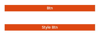
We get something similar, but it would be nice to round the edges. Unfortunately, no matter how we try, it’s impossible to round the edges of the button, but you can round the edges of the template responsible for displaying the button. To do this, add another style:
 <Style Selector = "Button / template / ContentPresenter">
            <Setter Property = "CornerRadius" Value = "10" />
</Style> 
It turned out almost similar, but there is a problem — when you hover over the button, a gray frame appears (hello from the standard style).
To do this, turn to the
 <Style Selector = "Button: pointerover / template / ContentPresenter">
            <Setter Property = "BorderBrush" Value = "# FFDD4812" />
        </Style>
So much better.
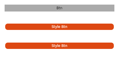
But what if I want to apply styles only to specific buttons?
Add one more button to the template and set the Classes attribute to the buttons that we want to “decorate”.
 <StackPanel>
        <Button Margin = "20" Content = "Btn" />
        <Button Margin = "20" Classes = "btn" Content = "Style Btn" />
        <Button Margin = "20" Classes = "btn" Content = "Style Btn" />
    </StackPanel>
And we’ll indicate to the styles that we need to influence only certain classes:
 <Style Selector = "Button.btn / template / ContentPresenter">
            <Setter Property = "CornerRadius" Value = "10" />
        </Style>
        <Style Selector = "Button.btn">
            <Setter Property = "Foreground" Value = "# FFFFFFFF" />
            <Setter Property = "BorderThickness" Value = "2" />
            <Setter Property = "Background" Value = "# FFDD4812" />
            <Setter Property = "BorderBrush" Value = "# FFFFFFFF" />
        </Style>
        <Style Selector = "Button: pointerover.btn / template / ContentPresenter">
            <Setter Property = "BorderBrush" Value = "# FFDD4812" />
</Style> 
All window code
<Window xmlns="https://github.com/avaloniaui"
        xmlns:x="http://schemas.microsoft.com/winfx/2006/xaml"
        xmlns:vm="clr-namespace:Wind1.ViewModels;assembly=Wind1"
        xmlns:d="http://schemas.microsoft.com/expression/blend/2008"
        xmlns:mc="http://schemas.openxmlformats.org/markup-compatibility/2006"
        mc:Ignorable="d" d:DesignWidth="800" d:DesignHeight="450"
        x:Class="Wind1.Views.MainWindow"
        Icon="/Assets/avalonia-logo.ico"
        Title="Wind1">

    <Window.Styles>
        <Style Selector="Button.btn /template/ ContentPresenter">
            <Setter Property="CornerRadius" Value="10" />
        </Style>
        <Style Selector="Button.btn">
            <Setter Property="Foreground" Value="#FFFFFFFF" />
            <Setter Property="BorderThickness" Value="2" />
            <Setter Property="Background" Value="#FFDD4812" />
            <Setter Property="BorderBrush" Value="#FFFFFFFF" />
        </Style>
        <Style Selector="Button:pointerover.btn /template/ ContentPresenter">
            <Setter Property="BorderBrush" Value="#FFDD4812" />
        </Style>
    </Window.Styles>

    <StackPanel>
        <Button Margin="20" Content="Btn" />
        <Button Margin="20" Classes="btn" Content="Style Btn" />
        <Button Margin="20" Classes="btn" Content="Style Btn" />
    </StackPanel>
</Window>
Another interesting styling example
The standard checkbox looks like this:

Improved checkbox is similar to android (a little)
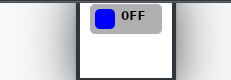
Improved checkbox is similar to android (a little)
A bit of magic
 <Window.Styles>
        <Style Selector = "CheckBox.uberbox">
            <Setter Property = "Template">
                <Setter.Value>
                    <ControlTemplate>
                        <Grid>
                            <Border Background = "# b0b0b0" Padding = "5" BorderBrush = "# 303030" CornerRadius = "5">
                                <Grid>
                                    <Grid Classes = "unchecked" ColumnDefinitions = "Auto, Auto">
                                        <Border Width = "20" Height = "20" Background = "Blue" CornerRadius = "5" />
                                        <TextBlock FontWeight = "Bold" Margin = "5,0,0,0" Grid.Column = "1"> 0FF </TextBlock>
                                    </Grid>
                                    <Grid Classes = "checked" ColumnDefinitions = "Auto, Auto">
                                        <Border Grid.Column = "1" Width = "20" Height = "20" Background = "Red"
                                                CornerRadius = "5" />
                                        <TextBlock FontWeight = "Bold" Margin = "0,0,5,0"> ON </TextBlock>
                                    </Grid>
                                </Grid>
                            </Border>
                            <Border Classes = "fade" Background = "White" CornerRadius = "5" />
                        </Grid>
                    </ControlTemplate>
                </Setter.Value>
            </Setter>
        </Style>

        <Style Selector = "CheckBox.uberbox / template / Grid.checked">
            <Setter Property = "Opacity" Value = "0" />
        </Style>

        <Style Selector = "CheckBox.uberbox: checked / template / Grid.checked">
            <Setter Property = "Opacity" Value = "1" />
        </Style>

        <Style Selector = "CheckBox.uberbox: checked / template / Grid.unchecked">
            <Setter Property = "Opacity" Value = "0" />
        </Style>
        <Style Selector = "CheckBox.uberbox / template / Border.fade">
            <Setter Property = "Opacity" Value = "0" />

        </Style>
        <Style Selector = "CheckBox.uberbox: pointerover / template / Border.fade">
            <Setter Property = "Opacity" Value = "0.2" />
        </Style>
    </Window.Styles>

    <StackPanel>
        <CheckBox Classes = "uberbox" Margin = "10" />
    </StackPanel>
Where to use styles
Styles can be used both within the window (as we did in the examples written above),
and within the entire application (then the style will apply in all windows).
To do this, add the style to the App.xaml file
 <Application.Styles>
        <StyleInclude Source = "avares: //Avalonia.Themes.Default/DefaultTheme.xaml" />
        <StyleInclude Source = "avares: //Avalonia.Themes.Default/Accents/BaseLight.xaml" />
        <Style Selector = "Button">
            <Setter Property = "Background" Value = "Blue"> </Setter>
        </Style>
    </Application.Styles>
Greater separation
With the complication of the code, we no longer want to keep the styles inside the window layout, but would rather put them in a separate file:
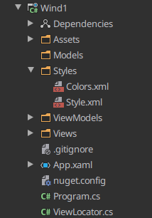
To do this, create the Styles directory and put our styles there in the form of xml or xaml files, adding the namespace:
 <Styles
        xmlns = "https://github.com/avaloniaui"
        xmlns: x = "http://schemas.microsoft.com/winfx/2006/xaml"
        xmlns: sys = "clr-namespace: System; assembly = netstandard">

    <Style Selector = "Button / template / ContentPresenter">
        <Setter Property = "CornerRadius" Value = "10" />
    </Style>
    <Style Selector = "Button">
        <Setter Property = "Foreground" Value = "# FFFFFFFF" />
        <Setter Property = "BorderThickness" Value = "2" />
        <Setter Property = "Background" Value = "# FFDD4812" />
        <Setter Property = "BorderBrush" Value = "# FFFFFFFF" />
    </Style>
    <Style Selector = "Button: pointerover / template / ContentPresenter">
        <Setter Property = "BorderBrush" Value = "# FFDD4812" />
    </Style>
</Styles>
Add new resources to the project file (* .csproj):
<AvaloniaResource Include = "Styles \ **" /> And connect them using the StyleInclude tag
 <Window.Styles>
      <StyleInclude Source = "/ Styles / Style.xml" />
    </Window.Styles>
But sometimes this is not enough, and I want to put the styles in a separate dll to use in all my projects.
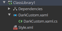
To do this, create a ClassLibrary and provide support for our future files as avaloina resource:
  <ItemGroup>
        <AvaloniaResource Include="**\*.xaml">
            <SubType>Designer</SubType>
        </AvaloniaResource>
    </ItemGroup>
    <ItemGroup>
        <AvaloniaResource Include="**\*.xml">
            <SubType>Designer</SubType>
        </AvaloniaResource>
    </ItemGroup>
Now add the already familiar Styles.xml and 2 more new files to the project:
In the xaml file, you must specify the namespace and the class to which it belongs, as well as the connection of the necessary resource:
 <Styles xmlns = "https://github.com/avaloniaui"
        xmlns: x = "http://schemas.microsoft.com/winfx/2006/xaml"
        x: Class = "ClassLibrary1.DarkCustom">
        <StyleInclude Source = "avares: //ClassLibrary1/Style.xml" />
</Styles>
And in the cs file we define that this is a style and no more:
 namespace ClassLibrary1
{
    public class DarkCustom: Styles
    {

    }
}
Add a dependency to our library and reconnect the style, specifying the style as an avalonia resource using StyleInclude and
 <Window.Styles>
        <StyleInclude Source = "avares: //ClassLibrary1/DarkCustom.xaml" />
    </Window.Styles>
Some more useful stuff
Be sure to check out the official Avalonia Style Tutorial ( here )
You can get basic ideas on how to write a style for an element here ( here )
And if you don’t have the time / desire to create your own style, then you can use this wonderful style generator ( here )

I would like to say thanks ForNeVeR kekekeks worldbeater
