In-depth UX case study describing the design and thinking process we went through while building better filtering and sorting experience in a backstage life of one of the most ambitious and rapidly-growing online shopping startups in Southeast Asia.


If thinking of how to illuminate the most crucial aspects of paving Product Listing Pages (PLPs) at iPrice, I would prefer to kick off with one of the most serious components - FILTERS. This was the primary focus in iPrice at the moment I joined the company.
In its turn, filtering/sorting strongly intersects with product item experience, which can't be simply avoided in the topic. The only perfect balance of both let users enjoy the shopping/browsing experience. Isn't it?
If you are interested to get the whole picture, I've done a deep dive into iPrice list item experience in this case study, called «iPrice Product Listing - UI/UX case study of list item experience».
There are tones of articles related to the «Filters» topic. I would prefer to keep this case study unique, therefore I will be short in things/facts/definitions which are already pretty obvious and well-known. I will try to be more specific and concrete where necessary to ensure we provide you with the real challenges, solutions, learnings we went through as a company and experienced ourselves.
iPrice as an aggregator focuses on simplifying a consumer's shopping experience by allowing their users to browse for products and compare prices from various online stores. It operates in 7 Asian countries. UX speaking wise, it is a very user-diversified web application.
The fundamental idea of the service is to be a one-stop destination/primary gateway to enable everyone in SEA to shop online, compare prices, and enjoy impartial product information through its catalogue aggregator platform.
iPrice hosts a catalogue of over 200 million products from over 1000+ merchants across the region, including big e-commerce sites like Lazada and Zalora.
It a critical and highly-consumed web application (~10 M monthly users, around 14 M monthly sessions including all 7 countries).
Worth to mention, iPrice is dramatically SEO driven and currently taking a leadership position in its monthly organic traffic compared to all other price comparison giants in the region.
1.3 Let's Sound the Problem & find out the Value
Since iPrice catalogue grows rapidly, the focus of the stakeholders laid on the panel of filters and their functional capabilities.
It is a well known, filters are a great tool to narrow down high volumes of content and to surface the most relevant results. Filtering is about empowering users to take a large, generic product listing and reduce it to a small, manageable selection of products that are uniquely tailored to their needs and interests.
At the same time, data analysis showed a high exit rate on our product category pages. It gave a clue that visitors aren’t finding what they want, which could be because product filtering is clunky or unhelpful.
For us as an Aggregator, the success definition is all about the following positive measures:
 Filters Usage Rate
Engagement
Retention
lower Bounce Rate
 And as a result of above mentioned shifts, positive progression in
  CTR, CR metrics, the most important business markers.
Our Mission is to ensure about Findability, Utility (helping users to find what they're looking for), Discoverability and Cross Sales (maximizing exposure to different products).
Hence, there are questions we have to answer:
To begin the research exercise, I started to look at a few competitors (price comparisons and e-commerce websites) or similar platforms, analysing UI, UX, User flow, IA and key features.
I won't go into detail, however, as I want to keep the focus on the research which has been made on iPrice itself.

In order to open the organization up to the realities of how customers see and experience the current «Filtering» process, we had to take an outside-in perspective by building series of Customers Journey Maps (CJMs).
It is a good tactic to visualize the process that a person goes through in order to accomplish a certain goal. It illustrates the activities and emotions customer goes through when engaging with the product around specific goals. Ideally told from an outside-in perspective , in other words, not from the organization's perspective.
The bigger value of a journey map:
— Provides an outside-in perspective
— Records the customer experience
— Looks across organizational silos
— Helps an organization to see the bigger picture
— Builds empathy for the customers, their needs and their language
— Delivers an engaging visual that people want to spend time with
Since I was a new joiner, I've had a chance to describe my own experience with the platform and interview some of my friends, those who frequently shop online. There are different types of CJMs, I was building Current State Maps.
Current state maps:
— Describe the current customers' experience
— Contain phases, activities within a phase, issues experienced, points of pleasure, customers' voice
— Uncover missed opportunities (how the user experience can be optimized) and tally up feature requests, all through insights gained from the mapping
Take a glimpse of the real example of a simplistic, high-level customer-journey map depicting how the persona «User X» experience iPrice «Filtering» process .
.
This CJM includes key components:
— Actor/Persona
— Scenario + Expectations
— Journey Phases
— Actions, Mindsets, and Emotions
— Opportunities
Open this image in a new tab to look into details

I won't go too deep in the topic of «Customer segmentation» in this article, because it is quite a huge subject, requires deep dive on its own. But I will slightly touch it up as a serious stepping stone on the way to the «filtering component» architecture on our PLPs.
Before building a new or redesigning an existing experience, the challenge is to find a smart way to move beyond a one-size-fits-all approach. At the end of the day, it is all about how customers behave at each stage in the customer journey. And the goal for us is to maximize the value of those elements/components, that actually consume real screen estate of the interface, elicit their effectiveness for customers during the flow. All to ensure every single component gets the job done and satisfy users' needs.
Buyer personas are fictional biographies that help to segment an audience. This allows us to tailor our product experience/marketing for each segment of users to better resonate with their needs and expectations, increasing engagement, and driving conversions.
From my perspective, «Filters» are super powerful and tricky component, it could be used in many scenarios, and by various types of users at a different point in time. The role of «Filters» is to pave a specific pathway or shortcut to each individual goal completion.
To start off, we had to think about modelling profiles based on our available qualitative and quantitative research focusing on:
Carefully mapped behavioural patterns benefit the business and it's UX department in ability to reveal wider range of unfulfilled user needs, such process fosters to gain diversified insights (less cases are omitted), hence more effectively shelf problems in terms of priority/expense/impact/quick win, etcetera.
On the Stage of «Segmentation» UX mission was to:
CJMs helped us to jot down the key behavioural patterns as well as reveal opportunities to fix the pain points identified in the process.
Therefore, based on available qualitative research methods and CJM tool, we were able to start off the process of modeling buyer personas/profiles.
Open this image in a new tab to look into details

After interviewing customers from different behavioural groups, it became clear, that «Filtering Experience» doesn't stop just on «cumbersome» traditional classic filter bar tool, it's usability and interface (that requires hefty improvements, such as UI, IA, interactivity, content renovation), it could be embodied through tones of various tools. These tools can be seen as facilitators in warming individual customers' motives up.
The main idea here is that when a Product Designer constructs the component is not enough to reach success by just drawing trendy UI elements and by following the right set of usability principles.
It is also about being able to «capture user's focus to the component», provide certain «guidance» at the right point in time. The existence of any component should be self-explanatory, perfectly fitting the global scene. Thinking «inside the component» and «outside of it» are two ends of one rope.
Balancing both can help us create things on demand, effective and useful.
Drawing a parallel with the work of a good architect, let's remember a quote from the famous «The Lake House» movie:
Based on the above-mentioned metaphor/statement, we could realize, that it is always good to step back and first assess the environment (the place, space), where business plans to re-think the component or build a new one. All to accommodate it in the best way to become an enticing accelerator of users' goal completion.
It is not something new I am highlighting here, but it is often used to be overlooked by the reason of business time pressure and delivery haste.
Here I would like to present the Holistic Concept of how to approach «Filtering Experience Construction» across product detail pages (PLPs) in a multilayered structure. This concept helps an organization to identify the gaps across all layers to ensure «outside component» factors get the job done.
Open this image in a new tab to look into details


Summarising the research, the following considerations were developed:
Filter Pattern. The current Filter Pattern is inefficient. First, you pick up the filter category, then, on a new screen, you choose the filter criteria. The existing filtering tool is using the «Fullscreen Filtering» pattern with the nested selections approach. Redundant clicks are performed during the filters switching process. It is difficult to adjust filters, time-consuming.
Nested screens take users out of a general context and require an additional effort to memorize all the micro-interactions a user performed recently. This experience puts a strain on the short-term memory because customers need to remember which filters are out of sight and mentally compare them to the filters they are looking at. In cases of filtering menus with tons of options, the cognitive load becomes too high and customers abandon the process.
All above negatively impacts following factors: discoverability, flexibility and accessibility.
Open this image in a new tab to look into details

2. Lack of «applied filters» list indication. There are two predominant design patterns for how to display the applied filter values. The first way is to keep applied filtering values in their original position, next to the unapplied filtering values of the same type. The second way is to display all applied filter values in a single combined list, typically placed either above the product list or at the top of the filtering sidebar.
Unfortunately, applied filtering values are implicit on our current UI (as on mobile as well as on desktop). They are kept in their original positions. The reason this particular «applied filters» placement doesn't get the job done is coming from an inappropriate filtering pattern implementation choice (nested screens). Unfortunately, a user is able to identify what filter criteria has been applied only when a user is inside a certain filter category.
As a result, it feels a lack of immediate feedback and flexibility to adjust them on the «fly», low «applied filters» accessibility. Some patient customers may return to the filtering menu to check the filters they've applied, but most may just give-up, especially if they can't find the wanted product. Some may just not even realize they are looking at filtered results and simply could leave the site.
Open this image in a new tab to look into details

Therefore, our users easily lose their sense of control, because the context factor is not there. It means, the interface doesn't let them know the filters they've selected have indeed been applied.
Users keep mentioning, that «It would be great to display all the parameters the current product list is filtered by in a way, which supports the basic user behaviour of being able to easily deselect/turn off applied filters».
3. Lack of visual cues, therefore lack of «confirmation». The number of «applied» or «on» filters is omitted. However, it is a highly important indicator, as it shows a direct interface response to the user, that the current product list is filtered by their preferable criteria. By all means, visitors expect to receive visual confirmation that filter navigation is working.
Open this image in a new tab to look into details

4. Interactive over batch filtering system. Interactive filtering could be irritative. It means the system reacts to users' every choice and refreshes the page every time. The success here depends on the site speed (how quickly a user gets the search results). Interactive filtering could be seen as a more convenient option, but only when it’s done promptly! Users are unwilling to wait after every move. This way of designing filters interactivity only applies to websites that don’t have the problem with loading speed.
The alternative to the first one is batch filtering, it means that the page refreshes and gives results only after a user made some selection and clicked the «Apply» button. It is beneficial if a website has speed problems. It saves a user time between requests. That is, instead of waiting for the result of each request, a user waits only once.
Nowadays, the most seamless interactivity pattern is that, which allows async content loading. It has the advantage of not slowing the page down and fetching the results without a full page reload by retaining the context of the current page.
Since our filtering is based on the first variant and business still wants to remain it (due to some limitations), the additional concern here is that the filter bar gets immediately hidden once one of the filters is selected. The user problem here is that it requires an extra effort (re-opening the filter bar over and over) and breaks the smooth sequencing of actions, especially when a user is willing to make several filter selections at a time. It actually means, even if customers have already applied one filter, they are not likely to repeat the same process again.
5. Category-Specific filters are not provided.
Universal filters narrow down results by common characteristics such as price, colour, or brand. However, we should also include filters that vary according to the category. This could mean 'Battery Capacity' or 'Display Resolution' under 'Smartphones' when shopping for electronics, or 'Sleeve type' or 'Length' under 'Kurtas' when browsing for clothes.
Discoverability and Focus of filtering/sorting tools could be increased to let them be better utilized looking forward. That could be achieved by fulfilling the gaps in the current interface experience:
Now, when we know the list of pain points, it is time to ideate solutions, which can solve determined people's problems.
5.1 Desktop Layout
I've proposed to get rid of conventional left-hand filter sidebar to rearrange it right above the product list instead, as a horizontal toolbar. It combines both, filtering and sorting tools. All to increase discoverability and utilization.
Such transformation significantly frees up horizontal screen real estate, which can be used for displaying either an additional product per row or larger product thumbnails. In our case, we decided to show more products per row on desktop, so we added an extra 5th column of products.
5.2 Mobile layout
We committed ourselves to a mobile-first strategy given the behaviour of our shoppers.
The most traffic comes from mobile devices:
Malaysia: 66%
Hong Kong: 63%
Indonesia: 82%
Philippines: 67%
Singapore: 64%
Thailand: 72%
Vietnam: 65%
It actually means that whatever we do, we think, breathe, and live mobile-first. So every screenshot, every mockup, every test, every demo starts with the mobile. That is why the article is mostly dedicated to mobile transformations.
While revisiting filters UI on mobile, the initial idea was to improve efficiency, explicitness, scannability of filtering/sorting tools. We tried to explore a more flexible, more useful, more accessible, and more elegant way to present them on the interface.
In order to make our filtering/sorting tool stand out, I had to ensure solutions meet both strategies, one of them concentrates on the higher discoverability of the traditional filter control and another one on the filters propagation outside the bar. All the proposed options follow the principle of persuasive design, where we allocate the space to promote certain filters or filters combinations.
There are 5 design proposals (A, B, C, D, E) demonstrated below:
Option A
I proposed 3 horizontal strips in this design ideation:
Option B
Similar to option A with the difference in the logic of the thematic filters, where they play the role of «smart recipes». «Smart recipe» could be perceived as a thematic filter, which is based on multiple cherry-picked product attributes and help the visitor quickly hone in on the desired product. The concept of «Smart recipes» requires a more complex logic compare to «quick findings». It applies context-oriented labels and comprises a mix of predefined parameters. Indeed, such an advanced recipe triggers multiple filter types. They are user-friendly shortcuts.
The most important here is to avoid the risk of being somewhat opaque to the user. To make it transparent, we could display a tooltip explaining which parameters are actually used in the «recipe».
Three filters participate in the above criteria: price (common), screen resolution (category-specific), and RAM (category-specific). Of course, a formula might be extended. It is up to the business what parameters and values supplement the criteria.
Open this image in a new tab to look into details

Option C
In this design I decided to unify filtering and sorting tools on the same horizontal line in order to free up ATF for the catalogue of products. It optimizes the usage of screen real estate.
In this concept, I've remained the «filter» button as a fixed element, when «sorting» became a swipeable component.
Option D - Similar to option C with the only difference, that sorting is designed as a fixed button (a selector drop-down) and filtering tool as a swipeable strip.
Open this image in a new tab to look into details

Option E
This concept is similar to the option D. The difference is that the entire strip becomes swipeable.
Here, the filtering tool is paired with the sorting tool and placed along that horizontally movable strip, however, both tools should still trigger their own onscreen windows/panels once user taps on one of them.
In this option, I was playing around the efficient, engaging ways to interact with the combination of both tools. When taking a glimpse to the design view of the option E, you will observe the list of sorting values are hidden inside the button control, when filtering options are accessible straightway, surfacing the most used parameters first.
The trade offs are: (+) «screen real estate optimisation, since both tools are in one line», (-) «sorting tool can be obscured while swiping», (-) «only few common filters are visible and fit on the screen at a first glance», (-) «sorting could be easily misinterpreted as filtering».
Open this image in a new tab to look into details

The battle between C and D
After reviewing all the ideas, the Business focus fell down to the C and D options. Our deliberations brought us to the main question — «Filtering or Sorting? What component should we opt for being swipeable and highly accessible at a first glance?». It is well known, that for the users, the outcome is roughly equivalent: both surface the most relevant content according to their criteria.
To answer the question of what tool is on a higher demand, we had to leverage data from different platforms and pull maximum insights out of it, all to study the usage of these 2 components.
Since most of iPrice users are mobile users, we used to solve problems with the «mobile-first» approach, as I mentioned earlier.
Of course, we assume, that it can be a repercussion of just non-optimized UX/UI of our filtering tool. We also understand that both tools are equally important in general. In addition, referring to the Baymard findings, some people use «sorting» and «filtering» interchangeably.
Data-driven approach and following facts and figures helped us to make up our mind:
The final solution
Summing up all of the above factors, the decision has been made in favor of the option C. As per «quick findings» and «smart recipes» filtering components, business set them apart, since both are quite high in development cost and require a certain level of maintenance/automation.
Please, take a look at the OLD and NEW UI of both tools (filtering and sorting) below.
Open this image in a new tab to look into details

5.3 New filter pattern
While addressing the filter pattern problem, we were considering several variants:
Open this image in a new tab to look into details

To make a final call we had to discuss the merits and the use case of each type of mobile filtering. So, let me briefly walk you through them:
Slideover onscreen filtering (Pattern A)
Such a pattern is a simple modal side sheet. It is surfacing supplementary content that is anchored to the left or right edge of the screen. It reveals by tapping «refine» or «filter» controls placed on the product listing screen as a slider, showing all the possible filter options.
Due to the limited screen size side sheet must be dismissed in order to interact with the underlying content. The benefit of this pattern is that it can help users stay in browsing context while refining the filter criteria.
Fullscreen onscreen filtering (Pattern B)
Such a pattern lets filters take up the whole screen of the results, and the user must dismiss the panel in order to see them. While this design pattern is sometimes necessary to provide enough screen real estate and more focused experience, it also takes the user out of the browsing context, which might not be the best idea.
Final solution
If we reckon our requirements and constraints, Pattern A facilitates better accomplishing the responsive design under AMP limitations.
Given all the above, Pattern A has been selected.
Please, take a look at the OLD and NEW UI below:
Open this image in a new tab to look into details

Open this image in a new tab to look into details

Altering filtering interactivity
A few words about filter selection interactivity. In the «pain points» paragraph I mentioned, that business wants to remain so-called «interactive filtering» since loading speed is not a problem for us. However, the behavior of the filter panel requires some improvements to let the interactivity work it's best, stick to users' expectations, and provide the smoothest continuous filtering experience. Based on the users' feedback, we clearly defined that the key is to remain the filter panel open, despite page reloads after every single filter application. In this sense, the search results are immediately refined, however, they are visible and accessible via the partly shown dim strip of the background with underlying content.
Such refinement lets a user feel in control of every step and makes the flow seamless.
5.4 Revisiting the UI in order to improve the
I've rolled out many overall UI changes, let me walk you through some of them:
As a Product Designer, I clearly understand, each project has its own unique priorities, challenges, and objectives that require different levels of UX input.
It is difficult to get the desirable budget and time to organize an ideal design process. There are tones of obstacles on the way, such as product could have certain technical constraints, which hinder on the way to meet all usability practices; stakeholders and their mindset could lean too much to «metrics» driven approach, so they are unfamiliar with usability and user-centered design culture; priority could fall to the right problem, but with a huge underestimation of the solution cost; there could be a minor focus to the research stage, it's time dedication, resource involvement, environment and so on.
Let me step back and remind the main mission business wanted to achieve with this challenge:
As a Product Designer, I had to zoom in and out of the given challenge to analyze how the entire concept of filtering could be actually seen. It’s useful to rotate the problem to look at it from different angles. Based on that, I've sketched the strategies in a way to target various user segments. All to find out what type of audience values the service the most and address, satisfy their needs, habits, and preferences.
However, I've realized the stakeholders have not been properly educated in the sense of user-centered design thinking yet. They've been approaching things conservatively, with the project-oriented mindset. That is the main reason filtering experience rolled down to one-sided enhancements in the spectrum of the traditional filtering sidebar.
It means we are actually making improvements and furthermore measuring the actual filtering usage for a very specific group of users. The success of the component depends on their presence on the website.
It is well known, presenting filters merely inside a traditional toolbar, despite how user-friendly it is, runs the risk of users either overlooking filtering options or not understanding the importance of making a selection in general.
I do believe, that the lack of a proper split testing environment and data tracking capabilities obscure the smarter strategy of being able to decompose the filtering experience into multiple functional segments. Shooting at these segments one by one with every new iteration cycle could help to identify the area, from where to pull out the most tangible value for the business.
However, beside all my personal thoughts above, we managed to achieve quite good results:
Nowdays users can easier discover the filtering and sorting controls and access their values in a less clicks.
We were able to positively boost some of the metrics as well as usability aspects.
What was the effort like and how about impact?
I believe we shouldn't be satisfied with the existing solutions without questioning them and trying to constantly improve them even if we fail many times during this process.
Given that iPrice is still in its infancy compared to markets like Europe or America, it always hungry for more and requires passionate talents, who are able to adapt, learn, and develop fast. The startup grows rapidly and urges you to grow non-stop too. I am lucky to get the chance to embrace its dynamic rhythm and culture.
This challenge was super motivating for me. I've learned how to get the most UX goodness by working out the best combination of activities that keep us closer to the outcome we are aiming for, within the time, budgetary and resource constraints of the project.
Besides my own field of research, where I significantly broaden my knowledge base, I've got a great chance to digest the product from different perspectives by being observing interactions between disciplines inside the company. I've definitely grown as a Product Designer while filling the gap between business and engineering and at the same time experiencing the company's model transformation towards the agile, dynamic, and volatile environment.
It took some time to realize what role design plays in the company, where revenue is coming from, and how the UX contributes toward that. I've also learned the engineering aspects to do a design that feasible to implement. Moreover, the engineers became my closest fellows, we've been learning of how to be self-organized through listening, trusting the expertise of each other. Team dynamics is highly important. I am lucky of being emerged in the process with people who are passionate to produce the best possible outcome and provide actual tangible value.
My postulates: one problem at a time, one step at a time. Decisions should be quick and painless. If it is not, I prefer to leave it for a while and return to it later with a fresh eye.
Thank you for reading! My desire is to exchange practices and learnings with people interested in product design. I hope you enjoyed this Case Study and picked up something valuable for yourself. If you wish to leave your feedback, I am welcome to hear from you and improve further.
Follow me on LinkedIn.
---

Demystifying my design process

1. Overview
1.1 About the Project
If thinking of how to illuminate the most crucial aspects of paving Product Listing Pages (PLPs) at iPrice, I would prefer to kick off with one of the most serious components - FILTERS. This was the primary focus in iPrice at the moment I joined the company.
In its turn, filtering/sorting strongly intersects with product item experience, which can't be simply avoided in the topic. The only perfect balance of both let users enjoy the shopping/browsing experience. Isn't it?
If you are interested to get the whole picture, I've done a deep dive into iPrice list item experience in this case study, called «iPrice Product Listing - UI/UX case study of list item experience».
Today's Case Study is a deep dive into a Filtering/Sorting Experience design process and it's role on iPrice product listing pages.
There are tones of articles related to the «Filters» topic. I would prefer to keep this case study unique, therefore I will be short in things/facts/definitions which are already pretty obvious and well-known. I will try to be more specific and concrete where necessary to ensure we provide you with the real challenges, solutions, learnings we went through as a company and experienced ourselves.
1.2 A few words about iPrice
iPrice as an aggregator focuses on simplifying a consumer's shopping experience by allowing their users to browse for products and compare prices from various online stores. It operates in 7 Asian countries. UX speaking wise, it is a very user-diversified web application.
The fundamental idea of the service is to be a one-stop destination/primary gateway to enable everyone in SEA to shop online, compare prices, and enjoy impartial product information through its catalogue aggregator platform.
iPrice hosts a catalogue of over 200 million products from over 1000+ merchants across the region, including big e-commerce sites like Lazada and Zalora.
It a critical and highly-consumed web application (~10 M monthly users, around 14 M monthly sessions including all 7 countries).
Worth to mention, iPrice is dramatically SEO driven and currently taking a leadership position in its monthly organic traffic compared to all other price comparison giants in the region.
1.3 Let's Sound the Problem & find out the Value Business Side
Since iPrice catalogue grows rapidly, the focus of the stakeholders laid on the panel of filters and their functional capabilities.
It is a well known, filters are a great tool to narrow down high volumes of content and to surface the most relevant results. Filtering is about empowering users to take a large, generic product listing and reduce it to a small, manageable selection of products that are uniquely tailored to their needs and interests.
At the same time, data analysis showed a high exit rate on our product category pages. It gave a clue that visitors aren’t finding what they want, which could be because product filtering is clunky or unhelpful.
For us as an Aggregator, the success definition is all about the following positive measures:
 Filters Usage Rate Engagement Retention lower Bounce Rate
 And as a result of above mentioned shifts, positive progression in
  CTR, CR metrics, the most important business markers.
Our Mission is to ensure about Findability, Utility (helping users to find what they're looking for), Discoverability and Cross Sales (maximizing exposure to different products).
Hence, there are questions we have to answer:
How do we make sure Filters are
a. Helpful rather than confusing (accessibility and usability) ?
b. Utilised by customers (high discovery rate and high usage rate) ?
2. Research
2.1 Competitive markets . Benchmarking competitor services
To begin the research exercise, I started to look at a few competitors (price comparisons and e-commerce websites) or similar platforms, analysing UI, UX, User flow, IA and key features.
I won't go into detail, however, as I want to keep the focus on the research which has been made on iPrice itself.

2.2 Customer Journey Maps
In order to open the organization up to the realities of how customers see and experience the current «Filtering» process, we had to take an outside-in perspective by building series of Customers Journey Maps (CJMs).
It is a good tactic to visualize the process that a person goes through in order to accomplish a certain goal. It illustrates the activities and emotions customer goes through when engaging with the product around specific goals. Ideally told from an outside-in perspective , in other words, not from the organization's perspective.
The bigger value of a journey map:
— Provides an outside-in perspective
— Records the customer experience
— Looks across organizational silos
— Helps an organization to see the bigger picture
— Builds empathy for the customers, their needs and their language
— Delivers an engaging visual that people want to spend time with
Since I was a new joiner, I've had a chance to describe my own experience with the platform and interview some of my friends, those who frequently shop online. There are different types of CJMs, I was building Current State Maps.
Current state maps:
— Describe the current customers' experience
— Contain phases, activities within a phase, issues experienced, points of pleasure, customers' voice
— Uncover missed opportunities (how the user experience can be optimized) and tally up feature requests, all through insights gained from the mapping
CJMs help discover stages where customers are not progressing, so we can identify the biggest obstacles and opportunities for improvement.
Take a glimpse of the real example of a simplistic, high-level customer-journey map depicting how the persona «User X» experience iPrice «Filtering» process
 .
.This CJM includes key components:
— Actor/Persona
— Scenario + Expectations
— Journey Phases
— Actions, Mindsets, and Emotions
— Opportunities
Open this image in a new tab to look into details

2.3 Segmentation and holistic «filters» usage concept
I won't go too deep in the topic of «Customer segmentation» in this article, because it is quite a huge subject, requires deep dive on its own. But I will slightly touch it up as a serious stepping stone on the way to the «filtering component» architecture on our PLPs.
It is well-known if your marketing is aimed at everyone, your message gets watered down and results suffer.
Before building a new or redesigning an existing experience, the challenge is to find a smart way to move beyond a one-size-fits-all approach. At the end of the day, it is all about how customers behave at each stage in the customer journey. And the goal for us is to maximize the value of those elements/components, that actually consume real screen estate of the interface, elicit their effectiveness for customers during the flow. All to ensure every single component gets the job done and satisfy users' needs.
Buyer personas are fictional biographies that help to segment an audience. This allows us to tailor our product experience/marketing for each segment of users to better resonate with their needs and expectations, increasing engagement, and driving conversions.
From my perspective, «Filters» are super powerful and tricky component, it could be used in many scenarios, and by various types of users at a different point in time. The role of «Filters» is to pave a specific pathway or shortcut to each individual goal completion.
To start off, we had to think about modelling profiles based on our available qualitative and quantitative research focusing on:
 Behavioural drivers: Customers' goals, what they want to accomplish, under what circumstances they've landed on the site, their environment and mood;
- Obstacles on the way: The hesitations and concerns customers have;
- Mindset/Motives: Take into account if the customers want bargains, some sort of guidance or more refined experience when they land on the website. Learn about their «motivation» driver.
 Behavioural drivers: Customers' goals, what they want to accomplish, under what circumstances they've landed on the site, their environment and mood;
Carefully mapped behavioural patterns benefit the business and it's UX department in ability to reveal wider range of unfulfilled user needs, such process fosters to gain diversified insights (less cases are omitted), hence more effectively shelf problems in terms of priority/expense/impact/quick win, etcetera.
On the Stage of «Segmentation» UX mission was to:
- Understand the variety of ways different customers approach the buying process;
- Build the holistic concept, which can visualize the most crucial layers of how the existing «Filtering» experience could be reconstructed in order to increase filters usage, therefore engagement. The concept had to lean on behavioural and motivational drivers of our potential customer segments;
- Substantiate the concept. Get buy-in from the POs and Stakeholders;
CJMs helped us to jot down the key behavioural patterns as well as reveal opportunities to fix the pain points identified in the process.
Therefore, based on available qualitative research methods and CJM tool, we were able to start off the process of modeling buyer personas/profiles.
Open this image in a new tab to look into details

After interviewing customers from different behavioural groups, it became clear, that «Filtering Experience» doesn't stop just on «cumbersome» traditional classic filter bar tool, it's usability and interface (that requires hefty improvements, such as UI, IA, interactivity, content renovation), it could be embodied through tones of various tools. These tools can be seen as facilitators in warming individual customers' motives up.
The main idea here is that when a Product Designer constructs the component is not enough to reach success by just drawing trendy UI elements and by following the right set of usability principles.
It is also about being able to «capture user's focus to the component», provide certain «guidance» at the right point in time. The existence of any component should be self-explanatory, perfectly fitting the global scene. Thinking «inside the component» and «outside of it» are two ends of one rope.
Balancing both can help us create things on demand, effective and useful.
Drawing a parallel with the work of a good architect, let's remember a quote from the famous «The Lake House» movie:
«A truly great structure, one that is meant to stand the tests of time never disregards its environment. A serious architect takes that into account. He knows that if he wants presence, he must consult with nature. He must be captivated by the light.»
Based on the above-mentioned metaphor/statement, we could realize, that it is always good to step back and first assess the environment (the place, space), where business plans to re-think the component or build a new one. All to accommodate it in the best way to become an enticing accelerator of users' goal completion.
It is not something new I am highlighting here, but it is often used to be overlooked by the reason of business time pressure and delivery haste.
Here I would like to present the Holistic Concept of how to approach «Filtering Experience Construction» across product detail pages (PLPs) in a multilayered structure. This concept helps an organization to identify the gaps across all layers to ensure «outside component» factors get the job done.
Open this image in a new tab to look into details


3. Defining the key pain points
Summarising the research, the following considerations were developed:
3.1 Looking at «Inside the Component» pain points
Filter Pattern. The current Filter Pattern is inefficient. First, you pick up the filter category, then, on a new screen, you choose the filter criteria. The existing filtering tool is using the «Fullscreen Filtering» pattern with the nested selections approach. Redundant clicks are performed during the filters switching process. It is difficult to adjust filters, time-consuming.
Nested screens take users out of a general context and require an additional effort to memorize all the micro-interactions a user performed recently. This experience puts a strain on the short-term memory because customers need to remember which filters are out of sight and mentally compare them to the filters they are looking at. In cases of filtering menus with tons of options, the cognitive load becomes too high and customers abandon the process.
All above negatively impacts following factors: discoverability, flexibility and accessibility.
Open this image in a new tab to look into details

2. Lack of «applied filters» list indication. There are two predominant design patterns for how to display the applied filter values. The first way is to keep applied filtering values in their original position, next to the unapplied filtering values of the same type. The second way is to display all applied filter values in a single combined list, typically placed either above the product list or at the top of the filtering sidebar.
Unfortunately, applied filtering values are implicit on our current UI (as on mobile as well as on desktop). They are kept in their original positions. The reason this particular «applied filters» placement doesn't get the job done is coming from an inappropriate filtering pattern implementation choice (nested screens). Unfortunately, a user is able to identify what filter criteria has been applied only when a user is inside a certain filter category.
As a result, it feels a lack of immediate feedback and flexibility to adjust them on the «fly», low «applied filters» accessibility. Some patient customers may return to the filtering menu to check the filters they've applied, but most may just give-up, especially if they can't find the wanted product. Some may just not even realize they are looking at filtered results and simply could leave the site.
Open this image in a new tab to look into details

Therefore, our users easily lose their sense of control, because the context factor is not there. It means, the interface doesn't let them know the filters they've selected have indeed been applied.
Users keep mentioning, that «It would be great to display all the parameters the current product list is filtered by in a way, which supports the basic user behaviour of being able to easily deselect/turn off applied filters».
3. Lack of visual cues, therefore lack of «confirmation». The number of «applied» or «on» filters is omitted. However, it is a highly important indicator, as it shows a direct interface response to the user, that the current product list is filtered by their preferable criteria. By all means, visitors expect to receive visual confirmation that filter navigation is working.
Open this image in a new tab to look into details

4. Interactive over batch filtering system. Interactive filtering could be irritative. It means the system reacts to users' every choice and refreshes the page every time. The success here depends on the site speed (how quickly a user gets the search results). Interactive filtering could be seen as a more convenient option, but only when it’s done promptly! Users are unwilling to wait after every move. This way of designing filters interactivity only applies to websites that don’t have the problem with loading speed.
The alternative to the first one is batch filtering, it means that the page refreshes and gives results only after a user made some selection and clicked the «Apply» button. It is beneficial if a website has speed problems. It saves a user time between requests. That is, instead of waiting for the result of each request, a user waits only once.
Nowadays, the most seamless interactivity pattern is that, which allows async content loading. It has the advantage of not slowing the page down and fetching the results without a full page reload by retaining the context of the current page.
Since our filtering is based on the first variant and business still wants to remain it (due to some limitations), the additional concern here is that the filter bar gets immediately hidden once one of the filters is selected. The user problem here is that it requires an extra effort (re-opening the filter bar over and over) and breaks the smooth sequencing of actions, especially when a user is willing to make several filter selections at a time. It actually means, even if customers have already applied one filter, they are not likely to repeat the same process again.
5. Category-Specific filters are not provided.
Universal filters narrow down results by common characteristics such as price, colour, or brand. However, we should also include filters that vary according to the category. This could mean 'Battery Capacity' or 'Display Resolution' under 'Smartphones' when shopping for electronics, or 'Sleeve type' or 'Length' under 'Kurtas' when browsing for clothes.
3.2 Looking at «Outside the Component» pain points
Discoverability and Focus of filtering/sorting tools could be increased to let them be better utilized looking forward. That could be achieved by fulfilling the gaps in the current interface experience:
- There are no other solutions to «filtering» interpretation, besides classical common filter bar solution. Following the principles of persuasive design, most sites, therefore, have a number of categories that need to promote certain filters or filter combinations outside the filter bar.
During interviews and usability testing, we observed that risk, when users simply overlook filter options, which are hidden in the bar at a first glance, some of them don't understand the importance of making the selection in general. Traditional filtering sidebar options are perceived by most users as purely optional choices; - The placement and tools visualization could be improved. The way sorting/filtering tools are showcased on the interface doesn't attract user attention as well as doesn't fully avoid the problem of misinterpreting the sorting tool for filtering options. The external UI of the component requires to be more prominent. It should be simple, self-evident, easily accessible and scannable.
4. Business challenges & requirements
- iPrice is a very «SEO» and «Organic Traffic» oriented startup.
The main goal was to adopt the product to AMP technology. Make PLPs AMP-compatible along with filtering experience revamp (we saw improvements in PDPs, inferred we'll get the same results with PLPs).
It means designing process in a frame of APM restrictions. The most important rule at that time was to avoid Java Script.
Since AMP loads faster, it is an advantage, which triggers a ranking signal. Web page speed improves the user experience and core business metrics. AMP pages load near instantly enabling us to offer a consistently fast mobile experience across all devices and platforms that link to AMP; - Pain points could be conquered differently when designing for various sizes of screen real estate. However, we have to keep in mind, that we are aiming for a responsive AMP design. Therefore, for sake of faster and easier development stage, the Structure (Interaction Design and IA) and the Skeleton (UI and Navigation) should remain similar across mobile, desktop viewports;
- Make sure solutions understand SEO and technical roadblocks.
5. Suggested solutions
Now, when we know the list of pain points, it is time to ideate solutions, which can solve determined people's problems.
5.1 Desktop Layout Stimulate filter/sorting tool Discoverability and Focus
I've proposed to get rid of conventional left-hand filter sidebar to rearrange it right above the product list instead, as a horizontal toolbar. It combines both, filtering and sorting tools. All to increase discoverability and utilization.
Such transformation significantly frees up horizontal screen real estate, which can be used for displaying either an additional product per row or larger product thumbnails. In our case, we decided to show more products per row on desktop, so we added an extra 5th column of products.
Interface before and after the transformation
Open this image in a new tab to look into details

Open this image in a new tab to look into details

Open this image in a new tab to look into details


Open this image in a new tab to look into details

Open this image in a new tab to look into details

5.2 Mobile layout Stimulate filtering/sorting tool Discoverability and Focus
We committed ourselves to a mobile-first strategy given the behaviour of our shoppers.
The most traffic comes from mobile devices
:Malaysia: 66%
Hong Kong: 63%
Indonesia: 82%
Philippines: 67%
Singapore: 64%
Thailand: 72%
Vietnam: 65%
It actually means that whatever we do, we think, breathe, and live mobile-first. So every screenshot, every mockup, every test, every demo starts with the mobile. That is why the article is mostly dedicated to mobile transformations.
While revisiting filters UI on mobile, the initial idea was to improve efficiency, explicitness, scannability of filtering/sorting tools. We tried to explore a more flexible, more useful, more accessible, and more elegant way to present them on the interface.
In order to make our filtering/sorting tool stand out, I had to ensure solutions meet both strategies, one of them concentrates on the higher discoverability of the traditional filter control and another one on the filters propagation outside the bar. All the proposed options follow the principle of persuasive design, where we allocate the space to promote certain filters or filters combinations.
There are 5 design proposals (A, B, C, D, E) demonstrated below
:Option A
I proposed 3 horizontal strips in this design ideation:
- Thematic filters. They play the role of «quick findings». «Quick findings» are promoted filters, highly relevant at a certain stage, with context-oriented labels. Such filters help to avoid indecisiveness for those non-advanced customers, which are lacking domain knowledge or its technical details. «Quick findings» could be offered as a supplement to the regular filter bar.
Option A illustrates the quick finding as a specific attribute under a predefined condition and it is paraphrased with other words for ease of customer perception.
Example: If a «Long-lasting» filter is selected, the product catalogue will be narrowed down to only those products which fall under predefined criteria: «Battery capacity >3500 mAh».
The «long-lasting» label sounds familiar to the user, it doesn't require an extra effort to dig deeper to a certain level of details or be familiar with the specification determinant. To become absolutely practical, filtering options should be clearly worded and easy to understand. - Sorting tool.It is visualized through «segmented buttons», allowing users to see every sorting option available. It is clear what the sorting option is and what other options they can select. This visibility enables them to sort content faster and easier.
- Filtering Tool. The swipeable filter bar is accommodated horizontally right above the product list. It is pinned to the top of the page so the filters are still available as the user scrolls. Such design interpretation provides an overview of the filters available at a first glance. This swipeable bar allows users to skim through all filter types, avoiding redundant clicks.
However, this filtering tool has the following trade-offs, such as (+)«easy to get track of applied filters, a clear indication is on the fly», (+) common filters are displayed and accessible straight away, no need to guess what is behind the «filter» or «refine» button", (-) «category-specific filter usually don't fit on the screen, being inaccessible at a first glance, a user has to swipe to the side or select any filter first to observe all existing inside the panel», (-) «if multiple filter values are selected within one filter type, it could be challenging to indicate the applied filter values as a part of the same filtering UI control outside the panel itself».
Option B
Similar to option A with the difference in the logic of the thematic filters, where they play the role of «smart recipes». «Smart recipe» could be perceived as a thematic filter, which is based on multiple cherry-picked product attributes and help the visitor quickly hone in on the desired product. The concept of «Smart recipes» requires a more complex logic compare to «quick findings». It applies context-oriented labels and comprises a mix of predefined parameters. Indeed, such an advanced recipe triggers multiple filter types. They are user-friendly shortcuts.
The most important here is to avoid the risk of being somewhat opaque to the user. To make it transparent, we could display a tooltip explaining which parameters are actually used in the «recipe».
Example: If «Premium Affordable» is selected, the product catalogue will be narrowed down to only those products which fall under predefined criteria: price in between RM 2000/3000, full HD/Retina screen resolution, 3+ GB RAM.
Three filters participate in the above criteria: price (common), screen resolution (category-specific), and RAM (category-specific). Of course, a formula might be extended. It is up to the business what parameters and values supplement the criteria.
Open this image in a new tab to look into details

Option C
In this design I decided to unify filtering and sorting tools on the same horizontal line in order to free up ATF for the catalogue of products. It optimizes the usage of screen real estate.
In this concept, I've remained the «filter» button as a fixed element, when «sorting» became a swipeable component.
Option D - Similar to option C with the only difference, that sorting is designed as a fixed button (a selector drop-down) and filtering tool as a swipeable strip.
Open this image in a new tab to look into details

Option E
This concept is similar to the option D. The difference is that the entire strip becomes swipeable.
Here, the filtering tool is paired with the sorting tool and placed along that horizontally movable strip, however, both tools should still trigger their own onscreen windows/panels once user taps on one of them.
In this option, I was playing around the efficient, engaging ways to interact with the combination of both tools. When taking a glimpse to the design view of the option E, you will observe the list of sorting values are hidden inside the button control, when filtering options are accessible straightway, surfacing the most used parameters first.
The trade offs are: (+) «screen real estate optimisation, since both tools are in one line», (-) «sorting tool can be obscured while swiping», (-) «only few common filters are visible and fit on the screen at a first glance», (-) «sorting could be easily misinterpreted as filtering».
Open this image in a new tab to look into details

The battle between C and D
After reviewing all the ideas, the Business focus fell down to the C and D options. Our deliberations brought us to the main question — «Filtering or Sorting? What component should we opt for being swipeable and highly accessible at a first glance?». It is well known, that for the users, the outcome is roughly equivalent: both surface the most relevant content according to their criteria.
To answer the question of what tool is on a higher demand, we had to leverage data from different platforms and pull maximum insights out of it, all to study the usage of these 2 components.
Since most of iPrice users are mobile users, we used to solve problems with the «mobile-first» approach, as I mentioned earlier.
Mobile data showed a very tiny difference, but in favor of sorting.
Of course, we assume, that it can be a repercussion of just non-optimized UX/UI of our filtering tool. We also understand that both tools are equally important in general. In addition, referring to the Baymard findings, some people use «sorting» and «filtering» interchangeably.
Data-driven approach and following facts and figures helped us to make up our mind:
- Given that mobile devices space is limited it is easier to fit sorting options along the horizontal strip;
- Traditional filtering tool is more complex in its nature since it can comprise different filter types and categories. In its turn, their range of values require bigger space and more focused experience in general.
The final solution
Summing up all of the above factors, the decision has been made in favor of the option C. As per «quick findings» and «smart recipes» filtering components, business set them apart, since both are quite high in development cost and require a certain level of maintenance/automation.
Please, take a look at the OLD and NEW UI of both tools (filtering and sorting) below.
Open this image in a new tab to look into details

5.3 New filter pattern aiming for Flexibility and Accessibility
While addressing the filter pattern problem, we were considering several variants:
Open this image in a new tab to look into details

To make a final call we had to discuss the merits and the use case of each type of mobile filtering. So, let me briefly walk you through them:
Slideover onscreen filtering (Pattern A)
Such a pattern is a simple modal side sheet. It is surfacing supplementary content that is anchored to the left or right edge of the screen. It reveals by tapping «refine» or «filter» controls placed on the product listing screen as a slider, showing all the possible filter options.
Due to the limited screen size side sheet must be dismissed in order to interact with the underlying content. The benefit of this pattern is that it can help users stay in browsing context while refining the filter criteria.
Fullscreen onscreen filtering (Pattern B)
Such a pattern lets filters take up the whole screen of the results, and the user must dismiss the panel in order to see them. While this design pattern is sometimes necessary to provide enough screen real estate and more focused experience, it also takes the user out of the browsing context, which might not be the best idea.
Final solution
If we reckon our requirements and constraints, Pattern A facilitates better accomplishing the responsive design under AMP limitations.
Given all the above, Pattern A has been selected.
Please, take a look at the OLD and NEW UI below
:Open this image in a new tab to look into details

Open this image in a new tab to look into details

Altering filtering interactivity
A few words about filter selection interactivity. In the «pain points» paragraph I mentioned, that business wants to remain so-called «interactive filtering» since loading speed is not a problem for us. However, the behavior of the filter panel requires some improvements to let the interactivity work it's best, stick to users' expectations, and provide the smoothest continuous filtering experience. Based on the users' feedback, we clearly defined that the key is to remain the filter panel open, despite page reloads after every single filter application. In this sense, the search results are immediately refined, however, they are visible and accessible via the partly shown dim strip of the background with underlying content.
Such refinement lets a user feel in control of every step and makes the flow seamless.
5.4 Revisiting the UI in order to improve the Look and Feel, the Usability
I've rolled out many overall UI changes, let me walk you through some of them:
- Based on filter usage analyses (relevant data from Kibana and Google Analytics) and observation during interviews I was able to streamline filter categorization («Brand», «Stores», «Price», etc.). I've moved high-traffic filters to a higher level in the scheme to serve visitors better;
- The promotion of important filters started with the «Brand» filter type. I've accommodated the swipeable line of brands above the main filter component. At the same time had a chance to revisit the UI of the «category carousel» section. All to foster ATF optimization;
Look at the UI change
Open this image in a new tab to look into details


- Beside common filters, I've encouraged the team to include filters that vary according to the category. Most of the time, users are interested in filtering a product list across category-specific attributes.
For example, for «smartphones» directory parameters like «Battery Capacity», «Display Resolution», «RAM» will play role of category-specific filters; - In order to display how many products fall under any selected filter category, I've added product quantity indication on the product listing;
- I've added a visual indicator on top of the filter control button as a cue showing the number of filters that are «applied» or «on». Such indication is a part of «filter status» update and user percives it as a system response on their filter application. This UI enhancement made it apparent for the user;
Look at the UI change
Open this image in a new tab to look into details


- I've proposed to truncate filtering values for long lists to not overwhelm the visitor. For most websites, 8–10 options are optimal. Therefore, the «others» feature has been introduced for the user to search for non displayed filter values ;
Look at the UI change
Open this image in a new tab to look into details


- I've made it easier for searchers to deselect filters as well as to add them by keeping «applied filtering values» in their original position, next to the unapplied filtering values of the same type. However, with a tiny caveat, that the selected value takes the first place in order. Our observations proved that when users want to «turn filter off» or «deselect», one of the first places they look at is the spot where they applied the filter in the first place ;
Look at the UI change
Open this image in a new tab to look into details


- As for Desktop, I've gotten a chance to benefit from both famous practices by showing «applied filters» in the original position and in the «applied filters» summary overview. Combination of these patterns is immensely helpful, since it is easier to find any currently applied filters. Their mix utilisation leads to a lower rate of user errors. Our users gain two handy ways to disable filters, one of them is a super quick deactivation of multiple filters in a row ;
Look at the UI change
Open this image in a new tab to look into details


- Regarding the price filter, I've refined its UI significantly, made the touch targets follow the finger-friendly standards, improved the interactivity, and strengthened its aesthetics.
For the sake of its flexibility, we've wanted to keep «Min»(lower limit) and «Max»(upper limit) input fields as user-defined filtering values and make them working simultaneously with the slider control function. Tweaking the slider, a user triggers the input field values and, following the design concept, vise versa.
We've decided to not provide users with upfront predefined set of price ranges to choose from. The separate «Go» button had to be embedded on the screen to send the request of price changes only right after a user completes filter alteration. This is to avoid unexpected page reload or experience of flickering content in given frames of our «interective filtering» pattern and inability to make transition towards async content loading;
Look at the UI change
Open this image in a new tab to look into details


- The filter/sorting bars became sticky to the top during scrolling, so it is always accessible whenever visitors desire to filter ;
Look at the UI change
Open this image in a new tab to look into details


6. Takeaways
As a Product Designer, I clearly understand, each project has its own unique priorities, challenges, and objectives that require different levels of UX input.
It is difficult to get the desirable budget and time to organize an ideal design process. There are tones of obstacles on the way, such as product could have certain technical constraints, which hinder on the way to meet all usability practices; stakeholders and their mindset could lean too much to «metrics» driven approach, so they are unfamiliar with usability and user-centered design culture; priority could fall to the right problem, but with a huge underestimation of the solution cost; there could be a minor focus to the research stage, it's time dedication, resource involvement, environment and so on.
The joy of UX is that there are so many tools and techniques that we can use to suit the specific constraints of a certain project. We have to learn how to balance in order to get the right amount of user input within given constraints. The trick is to work out the best use of your time.
6.1 Outcome, results and impact
Let me step back and remind the main mission business wanted to achieve with this challenge:
Improve Filtering and Sorting to help users narrow down the data that can be displayed according to what they are looking for.
As a Product Designer, I had to zoom in and out of the given challenge to analyze how the entire concept of filtering could be actually seen. It’s useful to rotate the problem to look at it from different angles. Based on that, I've sketched the strategies in a way to target various user segments. All to find out what type of audience values the service the most and address, satisfy their needs, habits, and preferences.
However, I've realized the stakeholders have not been properly educated in the sense of user-centered design thinking yet. They've been approaching things conservatively, with the project-oriented mindset. That is the main reason filtering experience rolled down to one-sided enhancements in the spectrum of the traditional filtering sidebar.
It means we are actually making improvements and furthermore measuring the actual filtering usage for a very specific group of users. The success of the component depends on their presence on the website.
It is well known, presenting filters merely inside a traditional toolbar, despite how user-friendly it is, runs the risk of users either overlooking filtering options or not understanding the importance of making a selection in general.
I do believe, that the lack of a proper split testing environment and data tracking capabilities obscure the smarter strategy of being able to decompose the filtering experience into multiple functional segments. Shooting at these segments one by one with every new iteration cycle could help to identify the area, from where to pull out the most tangible value for the business.
However, beside all my personal thoughts above, we managed to achieve quite good results:
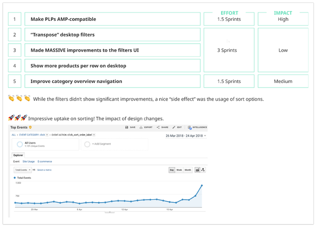
- Massive improvements to the filters UI some users (more advanced) are better engaged and able to find the right filters (reduces BR/improves pages per session);
- Mobile/Desktop filtering/sorting experience refinement requires less efforts and encounters less problems during in-panel filtering, all to not lower the reservoir of user's goodwill;
- Desktop filter «Transpose» lets users to narrow down their search faster (reduces BR);
- Product listing pages are AMP-compatible leads to faster mobile experience;
- Desktop interface accomodates more products per row users see more products at a time (improves CTR).
- Desktop/tablet listing pages got an odd grouping of products (thanks to new filtering layout and placement) odd numbers of products keeps the eye moving across a row because the items cannot be paired easily, so it facilitates scanning and users choice;
Nowdays users can easier discover the filtering and sorting controls and access their values in a less clicks.
We were able to positively boost some of the metrics as well as usability aspects.
What was the effort like and how about impact?

I believe we shouldn't be satisfied with the existing solutions without questioning them and trying to constantly improve them even if we fail many times during this process.
6.2 What I would've improved
- To intensify filters discoverability and usage, even more, I would have started to migrate efforts to the side of thematic filters incorporation and important filters promotion, working outside the filtering sidebar. It means fulfilling the gaps in pursuance of presented above «holistic filtering concept» diagram clues;
- Any piece of information that is so important that it's included in the list item is also so important that users will need a way to filter by it. I would have continued working on product card enhancements to add relevant and necessary information since, by virtue of displaying it in front of the user, we remind them that the spec is important. All to encourage users to filter by it.
- As per recently introduced UI, I would have allowed visitors to apply multiple filter values of the same type. If they want to look at black and silver smartphones, we should let them. Better to not force them to select one or the other at a time;
- Regarding interactivity, currently, any filter selection causes page reload. All these are outgoings of AMP compatibility as well as SEO restrictions.
I would have encouraged the team to circumvent the difficulties in bringing flexible interactivity to AMP pages. It would great to fetch and display search results without a full page reload, so users can have a seamless experience; - While «interactive filtering», it would be perfect to anchor the screen on a level of the last filter selection position (where an eye is focused on), to avoid screen «jumping» behaviour. Current implementation returns a user to the level of the top filters with every page reload;
- If given more time, I would’ve doubted about the «slider» in price filter implementation and done more rounds of usability tests across the topic.
I do believe «slider» has a more cognitive load for a user, particularly when it is not well done due to certain limitations. For instance, interaction implementation using slider has already led us to some time losses (especially in frames of AMP technology), engineers had to spend more time to overrule some technical constraints and, frankly speaking, the result is still far from expected. Together with the team, however, I would have still given it a chance if provided with more time and budget to improve it; - I would have continued running user tests on our filters. This will ensure our assumptions are validated by actual users, prior to changing them from assumptions/guesses to insights/facts;
- And a lot more…
6.3 What would I've done differently
- In relation to prioritization, I would have spent more time to convince stakeholders to approach things differently, by following the principles of persuasive design to lure the vast majority of users to benefit from our filters. This is achievable if actively promote important filters or filter combinations outside of the traditional filter bar. Indeed, the promoted filters can even apply multiple filters at once to provide the user with a shortcut to popular filter combinations. I've used these techniques in my early generated design solutions, they are presented above. I do believe, we could gain a better outcome since the approach is able to fuel the motives of a bigger mixed audience up by triggering users from various behavioural groups. Persuasive design is emphasizing a product’s benefits (that solve users’ current pain points) instead of its features.
Unlike outside suggested filters, traditional filtering sidebar options are perceived by most users as being purely optional and time-consuming.
Unfortunately, the PO led the team to a trap of an output-first mentality, he was obsessed with the feature radical-redesign decisions instead of following the outcome-led design process; - Overall, I would have simplified iterations and avoid one big extensive release. It's high-risk. Especially if the impact is not expected to be equally extensive. Taking into account we are renovating one of the most complex, largest website's components coupled with AMP compatibility, I would've challenged stakeholders to break down the vision into simpler MVPs and plan design in phases. Unfortunately, the company hasn't started cultivating an agile-driven mindset yet. «MVP builds» are an excellent opportunity to evaluate progress by presenting the smaller modifications at critique. It becomes easy to understand what works and what doesn't. If given more time and budget, I would've done more rounds of usability tests to catch loopholes and fix them;
- Understanding the effort of a component or its feature upfront requires time and involvement.
I would have immersed engineers in design phases earlier. Bouncing off early ideas with them could help us in narrowing down explore-worthy approaches to 1 or 2 good ones (taking into consideration technical limitations) and save time and energy.
Of course, it fosters an accurate delivery estimation, cost and reveals bottlenecks beforehand, lets engineers think upfront; - As for filters usage tracking configuration, PO was lack of strategic foresight by neglecting the benefit of establishing a tracking environment as the first preparation step.
I would have done a proper usage tracking setup before revisiting filtering UI and its experience to be able to measure the important stuff and easily pull valuable insights out of the data. If sorting tracking has been established a while ago, the filtering tracking configuration happened far after the new filters release and opportunity to compare the engagement level within old and new designs has been left out. For instance, the clicks distribution (to get the data about «filter control» activation) before and after a new filtering design release wasn't achievable;
7. Final thoughts
Given that iPrice is still in its infancy compared to markets like Europe or America, it always hungry for more and requires passionate talents, who are able to adapt, learn, and develop fast. The startup grows rapidly and urges you to grow non-stop too. I am lucky to get the chance to embrace its dynamic rhythm and culture.
This challenge was super motivating for me. I've learned how to get the most UX goodness by working out the best combination of activities that keep us closer to the outcome we are aiming for, within the time, budgetary and resource constraints of the project.
Besides my own field of research, where I significantly broaden my knowledge base, I've got a great chance to digest the product from different perspectives by being observing interactions between disciplines inside the company. I've definitely grown as a Product Designer while filling the gap between business and engineering and at the same time experiencing the company's model transformation towards the agile, dynamic, and volatile environment.
It took some time to realize what role design plays in the company, where revenue is coming from, and how the UX contributes toward that. I've also learned the engineering aspects to do a design that feasible to implement. Moreover, the engineers became my closest fellows, we've been learning of how to be self-organized through listening, trusting the expertise of each other. Team dynamics is highly important. I am lucky of being emerged in the process with people who are passionate to produce the best possible outcome and provide actual tangible value.
My postulates: one problem at a time, one step at a time. Decisions should be quick and painless. If it is not, I prefer to leave it for a while and return to it later with a fresh eye.
Thank you for reading! My desire is to exchange practices and learnings with people interested in product design. I hope you enjoyed this Case Study and picked up something valuable for yourself. If you wish to leave your feedback, I am welcome to hear from you and improve further.
Follow me on LinkedIn.
---
